Navigation Elements
Efficient navigation within the CRM is essential for increased productivity and user adoption. BostelCRM's user interface is designed to be user-friendly and we will cover its various elements in this section. The icons, menus, and information displayed on the screen may vary slightly depending on the size of the browser window or device being used to access BostelCRM. In this guide, we will cover the three primary view formats you are most likely to encounter: the larger web browser format view, the midsized tablet view, and the smaller phone-sized view. Please note that these are generalizations and not an exhaustive list, as the view format may differ depending on the device being used. Once you become familiar with navigating BostelCRM on any type of device, you should have no trouble using it on any platform.
-
Desktop View
- Top Navigation Menu
- Sidebar Menu
- Bottom Navigation Menu
-
Tablet View
- Top Navigation Menu
- Bottom Navigation Menu
-
Mobile View
- Top Navigation Menu
- Bottom Navigation Menu
Desktop View
Top Navigation Menu

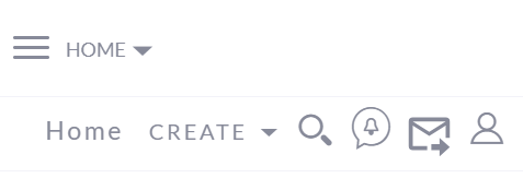
A top navigation menu is a primary tool for navigating to modules and managing records within BostelCRM. When on the Home page, the top navigation menu consists of nine elements, which are:
-
Home
By clicking on this feature, you will be directed to the Home page, where you can view your recently accessed items.
-
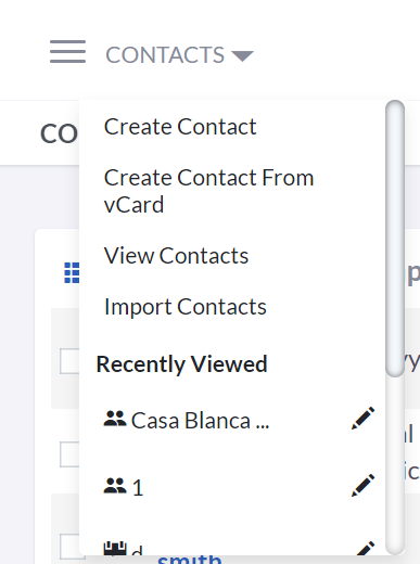
Module List Menu
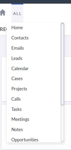
This feature displays a list of various modules within BostelCRM, allowing you to easily navigate to them.
To navigate to a module, hover or click on the Module List Menu button, which reveals a list of available modules. Clicking on a specific module name will direct you to the List View of that module. -
Module Menu
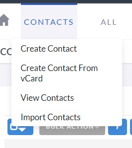
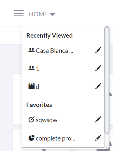
When you access a particular module, the menu that shows up between the Home button and the Module List Menu reveals the name of the module you are currently on.
Upon accessing a module, its name appears on the Top Navigation Menu, which provides a drop-down menu for available Actions, Recently Viewed, and Favorite records. Clicking on a record's name displays it while clicking on the pencil icon next to its name allows you to edit it directly. -
WorkGroup Name
This feature displays the name of your work group in the CRM, which you selected during account creation, typically the name of your business or company.
BostelCRM Logo
-
Quick Create
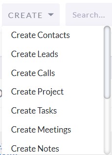
Within BostelCRM, the Quick Create feature enables users to swiftly generate essential module records.
By clicking the 'Create' icon on the top navigation menu, you can access the Quick Create options. This provides a list of frequently used modules and allows you to generate new records within those modules from anywhere in the system. -
Global Search

By utilizing the search feature, it is possible to conduct searches for data and records within BostelCRM.
The global search feature in BostelCRM allows you to explore all records. Clicking the magnifying glass icon on the top navigation menu opens a search text box, where you can enter your query and press return or click the search icon. Matching records are returned and categorized by available modules. Check the Search section of the user guide for more information. -
Notifications
This functionality exhibits the notifications that you have received.
If there are any reminder notifications, the notification icon will show the count, and clicking it will reveal a list of reminders. By selecting an item from the expanded list, you can access its detail view. For additional details on Desktop Notifications, refer to the relevant section of the user guide.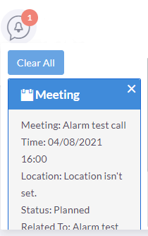
-
SMS
The SMS communication feature will be included in an upcoming update.
-
User Menu
You can view and modify your profile and log out of the CRM using the drop-down menu next to your name, which is shown as the currently logged-in user.
Hover or click on the user name/icon to open the user drop-down menu, which contains links to your profile, user guide, software information, and Sales Settings page for a product and PDF template management, and log-out option from BostelCRM. To learn more about these pages, see the User Profile and Sales sections in the user guide.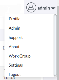
Desktop View
Sidebar Menu
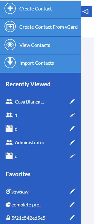
The sidebar is located on the left side of the window, below the Top Navigation Menu bar. It displays the five most recent records you've viewed under the Recently Viewed heading, enabling you to swiftly access a recent item by clicking on its title or edit it by clicking the pencil icon next to its title. Up to five favorite items can also be viewed or edited using the same methods. The sidebar is part of the responsive theme and can be expanded or collapsed by clicking the arrow button beside it.
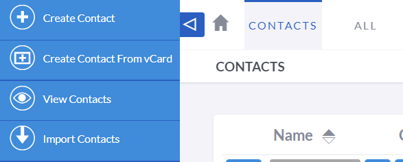
Furthermore, when you're in a module, the sidebar may show quick access actions based on the specific module you're using.
Desktop View
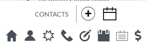
Bottom Navigation Menu

The bottom navigation menu offers easy navigation options within the CRM, with quick access to frequently used modules and a reminder of the current module. Additionally, it includes a Back to Top arrow for convenient scrolling to the top of longer records.

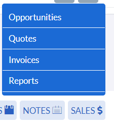
The Add button may appear on the bottom navigation menu in certain modules, allowing you to create new records within that module.
The sidebar is located on the left side of the window, below the Top Navigation Menu bar. It displays the five most recent records you've viewed under the Recently Viewed heading, enabling you to swiftly access a recent item by clicking on its title or edit it by clicking the pencil icon next to its title. Up to five favorite items can also be viewed or edited using the same methods. The sidebar is part of the responsive theme and can be expanded or collapsed by clicking the arrow button beside it.
Tablet View
Top Navigation Menu

In the Tablet view of the Top Navigation Menu, there is one more
slight difference: the User menu button no longer exhibits the user
name, but only shows the user icon. Nonetheless, you can still
access the same menu by clicking on it.
The tablet navigation menu resembles the desktop top navigation
menu, with a collapsed menu button (hamburger icon) that expands to
show the modules and allows you to create a record with the +
button.
You might observe another difference in that the module menu is now visible on the homepage. As a result of this change, up to three of your preferred items and the three most recently viewed items are presented in this menu, since the sidebar menu is no longer in use for this view. Similar to the sidebar menu, you can effortlessly navigate to these items or modify them using the pencil icon.
Tablet View
Bottom Navigation Menu


The bottom navigation menu in the tablet view remains unchanged from the browser view.
Mobile View
Top Navigation Menu
The top navigation menu in mobile view is similar to that of the browser and tablet views, but it is slightly reorganized to fit in a smaller window. If you are comfortable working with one of those views, you should have no trouble recognizing and navigating through the mobile view as well.
Mobile View
Bottom Navigation Menu

Although the phone view bottom navigation menu may look slightly different, it is essentially the same as the other views. The menu has most of the text removed, leaving only the current module name and icons.